
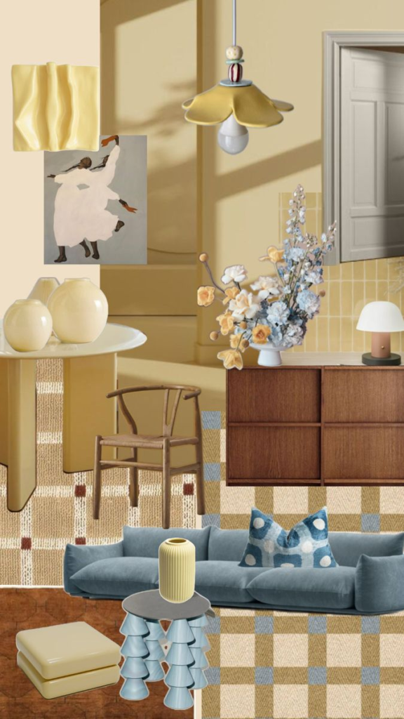
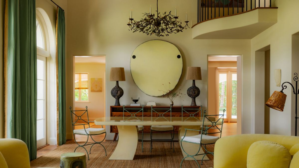
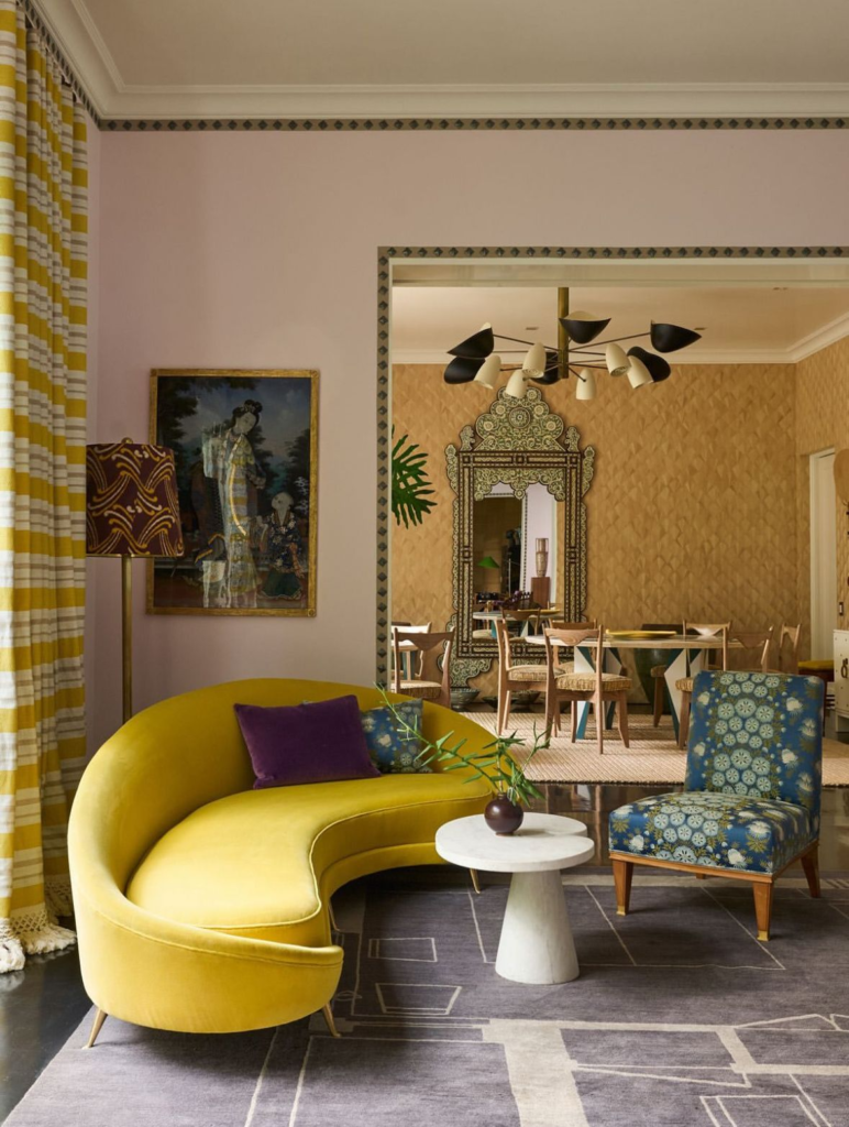
As we lean into the heart of May, the design world is pivoting away from the stark, “sad beiges” of years past. In their place? A hue that feels like a collective deep breath: Butter Yellow.
It’s soft, optimistic, and unapologetically cheerful. But don’t mistake this for the primary yellows of a nursery—the 2026 iteration of yellow is creamy, sophisticated, and behaves almost like a neutral. Here is how to wash your home in the glow of the season’s favorite shade.
1. The New Neutral

The beauty of Butter Yellow lies in its versatility. It sits perfectly between a rich cream and a muted gold. Because it has a significant amount of white in its base, it can be used on all four walls without overwhelming a space.
- The Look: Pair it with crisp white trim for a classic “Cape Cod” feel, or lean into a modern look by pairing it with charcoal or deep navy accents.
2. Small Pops, Big Impact
If you aren’t ready to commit to a gallon of paint, Butter Yellow is the perfect “accent” color for a seasonal refresh.
- Textiles: Swap out your heavy winter throws for butter-hued linen pillows.
- The “Unexpected Red” Theory (Yellow Edition): Interior designers are currently obsessed with the “unexpected” pop. Try painting just the inside of a bookshelf, a single window frame, or a set of dining chairs in this sunny shade. It provides a focal point that feels intentional rather than accidental.
3. The Perfect Pairings
To keep Butter Yellow feeling “high-end” rather than “country kitsch,” you have to be strategic with your palette.
- Butter + Sage Green: A nod to the May landscape. It’s calming, organic, and timeless.
- Butter + Sky Blue: A classic high-contrast pairing that feels like a clear spring morning.
- Butter + Terracotta: For a Mediterranean-inspired warmth that feels grounded and earthy.
4. Lighting Matters
Yellow is a “chameleon” color—it changes drastically depending on the light.
- North-Facing Rooms: Butter Yellow can help “warm up” the cool, bluish light of a northern exposure.
- South-Facing Rooms: The afternoon sun will make this color feel incredibly vibrant. We recommend choosing a “dustier” version of the shade to ensure it doesn’t become too neon during golden hour.
The Butter Yellow Cheat Sheet
| Room | How to Use It |
| Kitchen | Cafe curtains or hand-painted ceramic canisters. |
| Bedroom | A buttery velvet headboard or a light linen duvet. |
| Entryway | A statement console table to welcome guests with warmth. |
| Bathroom | Scalloped hand towels or a patterned bath mat. |
Designer’s Note: “Yellow is the color of dopamine. In a world that can often feel chaotic, coming home to a Butter Yellow room feels like a warm hug. It’s the ultimate mood-booster for the modern home.”
Is your home ready for a glow-up? Check out our curated “Butter Yellow” collection in the shop now to find the perfect accent pieces for your space. For more inspiration and ideas, contact us.